Sunnybrook Collateral
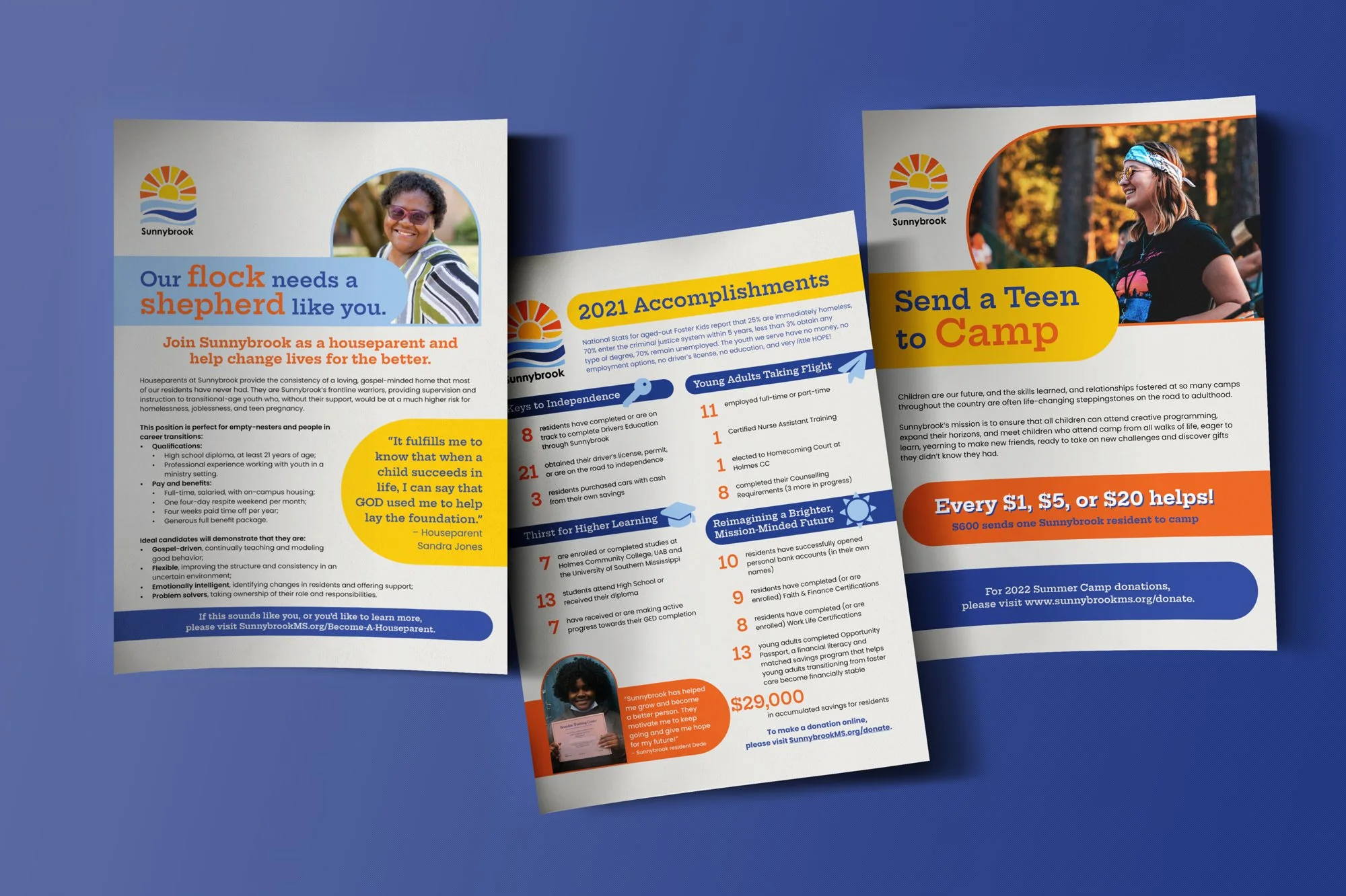
Sunnybrook Children’s Home provides awesome support to transitional-age youth and foster families in Mississippi. I gave their style a little facelift when I started working with the great guys at POUNCE on their collateral. With just a few tweaks to their branding, their overall look is updated and better tailored to their target audience, without the rigmarole of going through an otherwise unnecessary rebrand.
Work completed as part of strategic partnership with POUNCE
SCOPE
Brand Development
Visual Identity
Print Collateral
Layout
Old Style
New Style
A Grown-Up Glow-Up
Sunnybrook mostly works with youth aged 16-21 years old, and their original handwritten font felt a little young for their target audience. With a more mature but still fun typeface, a bold geometric element, and bigger blocks of intense color, the Sunnybrook brand got a serious spruce-up without a ton of investment.


